


Test tournament info - Updated!
Дата: 13.02.2016 15:07:20
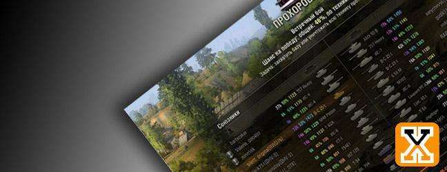
 SanyaJuutilainen, on 12 February 2016 - 06:47 PM, said: Feedback topic is still locked, so for the interface:
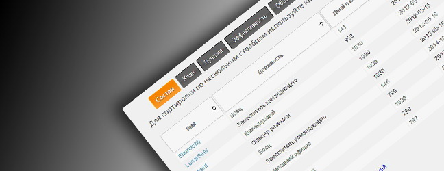
- if your window is small (1280 and less width), the fields in ABOUT overlap (particularly total pool of gold is very long)
- there are some untranslated bits (warning messages in the form, team format is "3 бойцов + 2 in reserve" - vehicle tier is VI max and 3 + 2 reserves, but total vehicle tier is 30 - shouldn't this be 18? - additional restrictions icon looks like a clickable element ("close me"
- should there be something in the left menu in rules and restrictions? Why is the element clickable? - any variable in the main text is lacking spaces around it (your names, numbers of players) - in the login form, the submit button is grey and nothing hints that it should be orange before submitting. Tried clicking it few times and couldn't find out why I couldn't submit my team
- I couldn't submit because they had 3 letters only and minimum is 4 letters, which is only written there in tiny red Russian letters.It would be better, if you clicked the grey button and the problematic field extra highlighted, because lots of players are going to miss that, I think
- and finally - why only 12 letters for the team name? Someone decided that VARCHAR(12) was the way to go?
Berbo: Hey there, Thanks a lot for the detailed list. You
may post wherever you like, no problems ") The goal here is mainly to
see how do you like the interface concept and the whole experience.
Russian text, wrong settings is just a tiny fix, no major issue.
Team name size is really weird, I have to admit. Maps are
working as intended for now As for login form, I could use
screenshots along with the explanation (if it's not too much bother
^^) Looking forward to hear back from you and thanks for
submitting a team As for other points, I'll look
at
The goal here is mainly to
see how do you like the interface concept and the whole experience.
Russian text, wrong settings is just a tiny fix, no major issue.
Team name size is really weird, I have to admit. Maps are
working as intended for now As for login form, I could use
screenshots along with the explanation (if it's not too much bother
^^) Looking forward to hear back from you and thanks for
submitting a team As for other points, I'll look
at
Test tournament info - Updated!